UX Design Internship
Improving Unite Us's Public Resource Directory (PRD)
ORGANIZATION
Unite Us
ROLE
UX Design Intern
TIMELINE
June - July 2024
Tools
Figma, Figjam, Slack, Zoom, Docs, PRD
Before redesign
Outdated and inconsistent menu UI

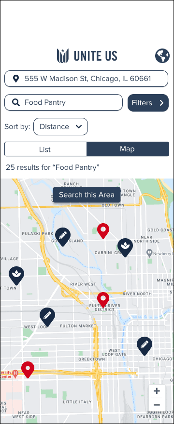
Redesigned menu - list view
Use the menu to easily search for services.

Redesigned menu - map view
Use the menu to easily find relevant services.
Confidentiality Disclaimer
Due to the nature of the work involving confidential company content, roughly 80% of the work from my internship (including but not limited to user flows, journey mapping, screenshots, and mock-ups) is not available to the public. If you would like to know more about what I did during my time at Unite Us, please contact me to discuss further.
In the meantime, my work for the Public Resource Directory project is approved for showcase, as the nature of the work is public-facing.
Public Resource Directory (PRD) Project Description
In week 5 of my internship at Unite Us, I was tasked with providing suggestions and creating a mock-up for Unite Us's Public Resource Directory. Most notably, I made several design changes to the mobile PRD interface.
Design Decisions
Below are my design decision reasonings for the PRD mobile menu redesign:
Changed the color of the medium blue icons to the native blue brand color used in the rest of the page.
To keep the design system consistent
There was no reason behind the design decision to add contrast and emphasis to the icons to be a different color from the other elements
Removing the chevron arrow in the search bar chevron arrow
To keep it consistent with the location search bar that didn't have a chevron (Gestalt's principles)
To keep up with UI trends
Change the Sort By's button caret to a chevron
Chevrons are more intuitive that carets
Rounded corners UI
UI trends
Add a chevron to the Filters button
To keep it consistent and similar to the Sort by button (Gestalt's principles)
Move "results for 'text entry' to below the menu, just above the card
This is informative text to the user, not a configurable action and thus should not be grouped with the menu elements
Adding a drop shadow to the card
UI trends
Sticky menu decisions
Currently, the entire menu and upper screen is sticky, obstructing the viewer from seeing more service and program information at once as they scroll
The goal is to reduce the size of the current sticky menu to the essential parts because current sticky menu takes up too much space, hindering the user from viewing more information at once as they scroll
I accomplished this by making solely the search, filters, sort by, functions in the menu sticky
The choice of what to keep sticky was determined by what users were most likely to use.