RESEARCH-DRIVEN
University of Washington's All-In-One New Student Guide


Project description
The product aims to assist newcomer students who are moving to Seattle, targeting students that are out-of-state, international, and generally new to the Seattle area.
As moving into the city requires lots of work and planning, the goal is to assist students to be informed before, during, and after the relocation journey to mitigate stress and concerns.
While current informational guides exist, there is a lack of central, relevant and detailed guide that is easily accessible, organized, well-structured, and easy to navigate. Thus, Dawgs Guide strives to be a product that fulfills that need.

Timeline
From explorations to final designs in 10 weeks (1 quarter) while working with multiple projects, coursework, clubs, and jobs at the same time.
Background
In 2022, the University of Washington (Seattle) welcomed 11,510 freshman and transfer students.
3,491 (30.3%) of those students are non-Washington residents.
Given that more than 1/3 of the students aren’t from Seattle, they are likely unfamiliar with Seattle’s day-to-day culture. This leaves thousands of students uncertain and anxious of what to expect when moving to Seattle for school the first time.
With this product, I wanted to help those incoming students obtain relevant information to navigate life not only as a student in Seattle, but also as an independent adult.
Goal Statement
How might we help incoming students moving to Seattle obtain relevant and important information/knowledge to navigate student life in a new city?
Competitive Analysis
Before jumping into the project, I conducted competitive analysis with existing digital information guides and resources that aim to provide information for Seattle travelers.
The findings revealed that the target demographic for such resources were typically Seattle tourists. Common information included popular tourist location, a brief overview of weather and transportation expectations, nearby hotels, local outdoor activities such as nearby parks and waterfronts.
I also conducted informal competitive analysis with college move-in guides. The investigation revealed that though they were a good starting point, they were too general and did not emphasize what users needed to know versus "fun material".
User Interviews

To gain valuable insights, I conducted four interviews with individuals who recently moved to Seattle for education at the University of Washington. Focused on gathering information from those who have experienced the transition, I aimed to identify current challenges and pain points.
In the interviews, I asked the participants questions surrounding these topics:
Current living situations
Their familiarity with "adulting" in Seattle
Activities the participants have been wanting to do
Concerns they had while moving
Information they would have liked to have known before moving
What the participants wanted to do
Post-Interviews
After conducting the interviews, I pooled the collected data together with the following key insights from the participants:
Understanding Seattle’s social culture
Referencing the “Seattle Freeze” & its difficulty in forming social connections and relationships.
Over-packing due to uncertainty
Concerns and worries about forgetting something essential led to participants to pack more than needed. They only realized after arriving, regretting that they packed more than they needed to.
Drastic Seasonal Change
Lack of sunlight during winter seasons would require participants to intake Vitamin D supplements. The infamous Seattle rain comes somewhat suddenly and occurs randomly.
Not exploring Seattle
Many chose to not explore the city due to the time and effort required to research places, indicating inaccessibility to easy-to-use resources.
Personas
To help understand the users that I am designing for, I went about creating two personas meant to represent the targeted user base of the product. Introducing, Jared and Michelle:

Jared is a first year student who recently moved to Seattle as a freshman. Not locally from Seattle, wants to know about the resources that will help him navigate school and the big city.
Jared wants to be:
Fostered in a community with friends
Able to navigate his way through college and have the resources/knowledge to achieve that.
However, at 19 years old, Jared lacks the information to be independent:
Cost & location of required goods/supplies
Geographic knowledge and safety.
In his time here, Jared would like:
Stable housing & reliable landlords
To save money
To know where to obtain appropriate materials and necessities conveniently

Michelle is a first-year graduate student who just moved to Seattle for school. Wanting to get out and make new friends, it’s been difficult to adjust to the local weather in the PNW.
Michelle wants to:
Make new friends
Explore Seattle & the outdoors
Obtain the appropriate seasonal clothing
Being new to the state, Michelle struggles with:
The weather
Housing
Cost of activities
Immersing herself in a new area, Michelle would like:
To know all events occurring around her
Dress appropriately for the weather
Be informed of the necessities in Seattle
User Journey Map
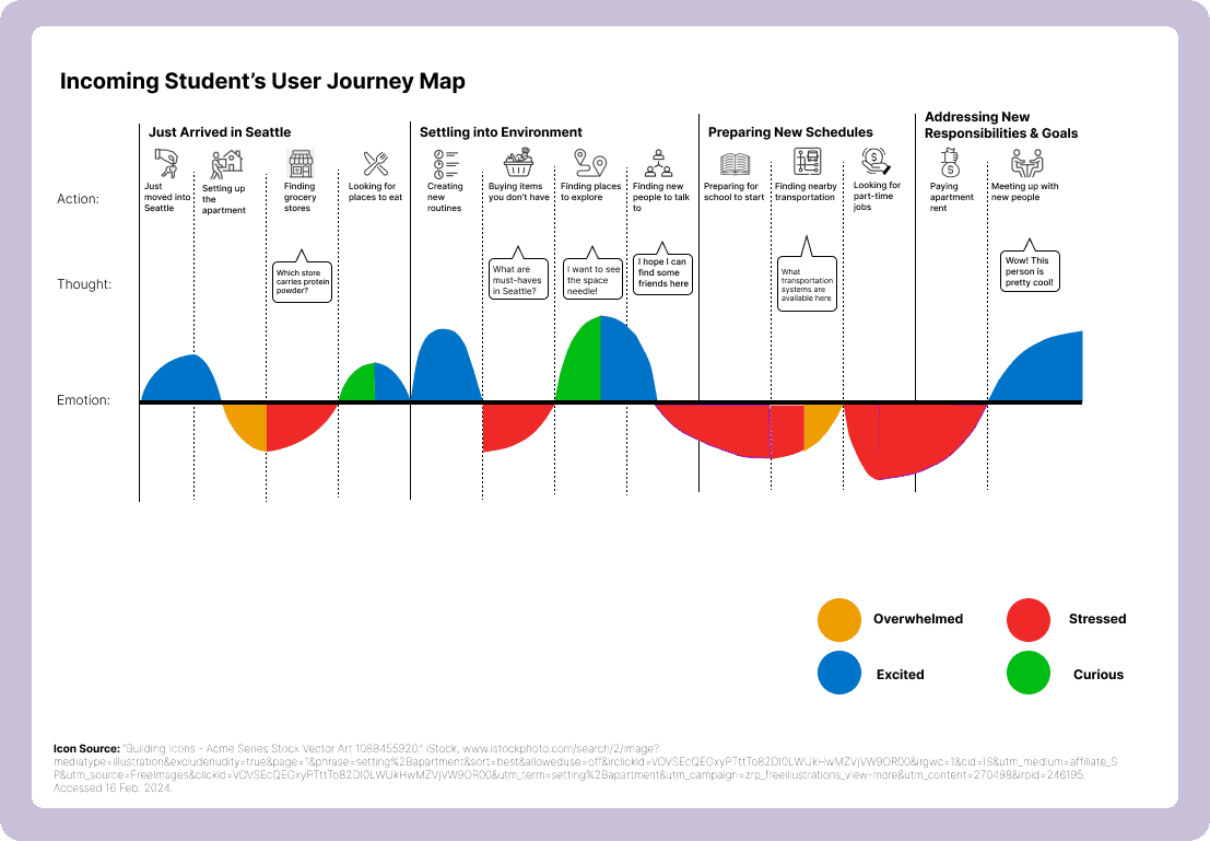
I crafted a comprehensive student user journey map tailored for individuals who have recently arrived in Seattle, with a timeline spanning from their arrival to the start of school.
The goal was to illuminate the potential actions the users might undertake as they navigate and prepare for school and life in Seattle. Each identified action is paired with an emotion, serving as a nuanced guide for the design focus.
This approach revealed areas where the designs can inspire and excite students. By acknowledging and addressing the diverse emotions associated with each step, aiming to create a user experience that not only meets functional needs but also nurtures a positive and empowering emotional journey for the users.
Storyboards
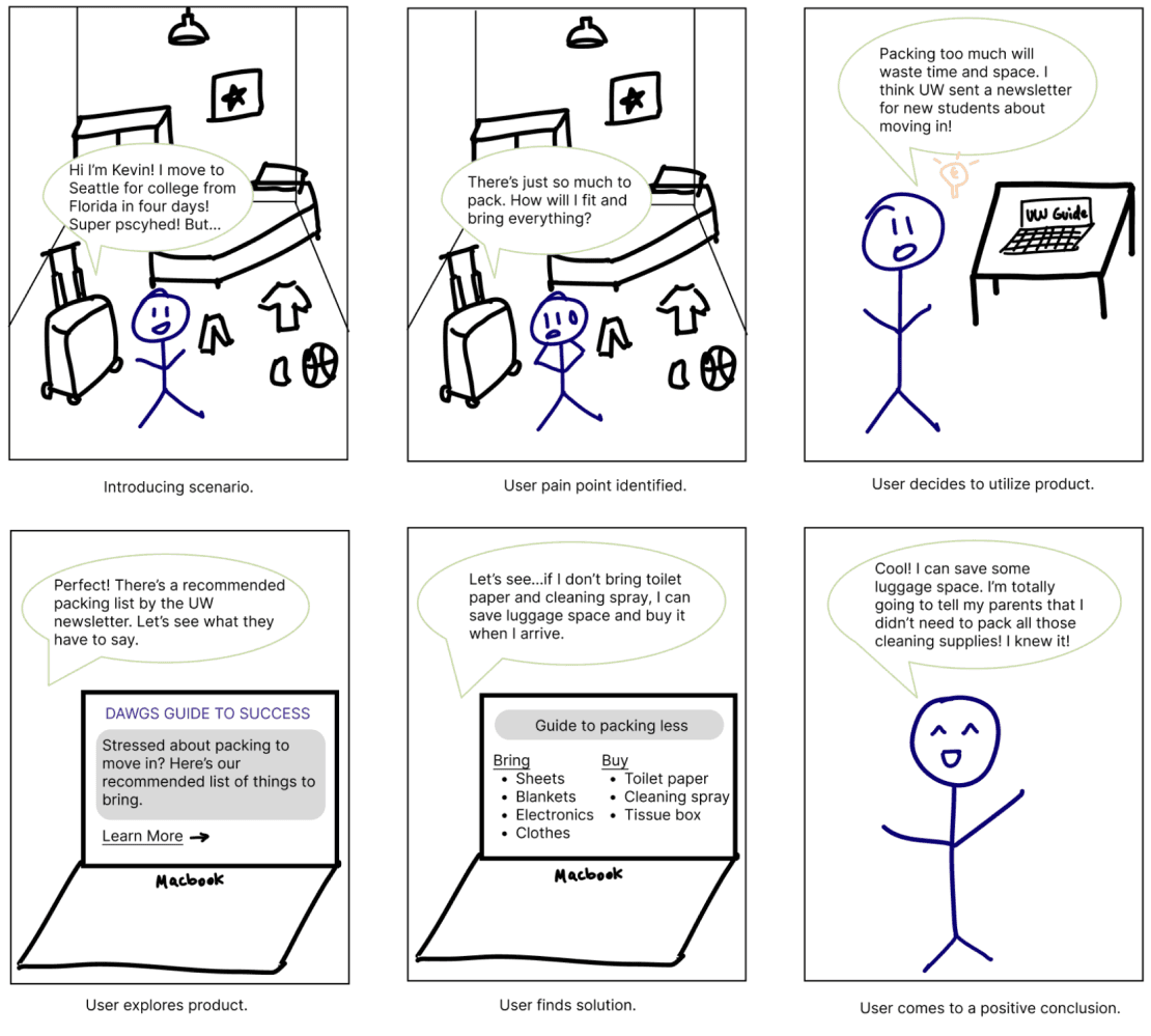
In association with the user journey map, I created storyboards in which the potential solution would apply in distinctive scenarios. A scenario represents a different environment where the users would encounter an issue, utilizing the product to help guide them through their troubles.
The scenario depicts a user packing all their necessitates as they prepare to move to Seattle. The problem starts where there is too much to pack and the student doesn’t know what to bring/leave behind. The student recalls the UW Student Guide and utilizes their resources to find items they should pack versus should purchase after moving to reduce their luggage and stress.
Design Requirements and Goals
After the user research phase, I began the compile a list of design requirements and goals that would address the user's needs and pain points.
Design Requirements:
Provide resources related to “adulting” e.g. banking & finances, medical centers.
Inform students of organizations they can get involved in to cultivate a sense of community.
Provide students with information of local grocery stores near the school/dorm.
Inform students about housing options (dorms, apartments).
Suggest local outdoor activities and tourist locations for students.
Suggest items to pack vs buy.
Provide information about Seattle local transportation and the weather/climate.
Design Goals:
Reduce the anxiety and concerns for incoming students as they move and get situated.
Provide guides, information, and resources specifically tailored for UW students
Offer a concise space/directory for students to find relevant information.
Design Iterations & Decisions
After creating the design requirements, I entered into the ideation and sketching phase. Throughout the iterations, each version of the initial design encountered road blocks that limited the ability to address the design goals effectively.
Jared is a first year student who recently moved to Seattle as a freshman. Not locally from Seattle, wants to know about the resources that will help him navigate school and the big city.
1.0 Physical Design:
Limited reachability.
Difficult to easily update information.
Unsustainable and potentially wasteful.
2.0 Email Newsletter:
Fewer interactions with users.
Require user to be led to an external source.
Can annoy or frustrate the user with spam.
Can be easily ignored by the user.
Can be difficult to find and access when needed.
3.0 Website:
Enables the user to easily access from their device.
Highly interact-able.
Can easily be updated with the latest information.
Content can be easily copied and pasted into the user's personal document or list.
The first 2 ideations proposed the idea to have the ability to update information, while allowing users to interact with the design without restriction. After adapting the initial designs strengths into the third and final design proposition.
The finalized design in a website emphasizes the power to update information while focusing on meaningful interaction that can personify and tailor the experience to user needs.
Low fidelity Wireframes
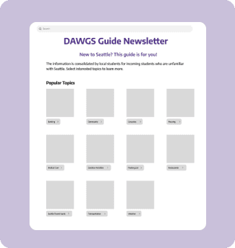
After weighing all the options pros and cons, I decided to create a website. I began by design process by creating lo-fi wire frames to help me visualize the content and structure the information architecture.

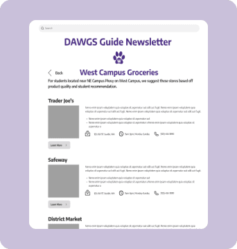
The user can click on one of the topics that interest them. In this case, let's use Groceries as an example. The user selects Groceries, then selects the side of campus they live in to see relevant options to them..
For the home page, I listed topics in rows of 4, alike a grid, so that users could easily view all of their options at ta high-level glance and click into what they want to learn more about.
I then decided to add more specific sections so that users could choose the section they find most useful to them and not be overwhelmed with irrelevant information and only need to look through options that are useful to them.
User Testing
Once I completed the lo-fi wireframes, I conducted usability testing with relevant participants who attend the University of Washington. I compiled a list of pre and post-interview questions to best discover pain points with the design and receive user feedback.
Pre-Interview Questions
How long ago did you move to Seattle?
How do you currently find information related to being in a new city?
What did you wish you knew when moving that you now know?
Task Completion and Observation
I had each person interact with the design using the figma prototype. I gave them no help unless they really couldn’t figure it out so I could figure out what components didn’t make sense and were confusing to them.
Post-Observation Interview
What did you find most confusing/troubling about this process?
The question was designed to look for parts of the process where there was a lack of clarity in the process. Additional sections or guidance can be added later in the improvement process to help users better understand and use it.
What do you like least about the product?
The question was designed to help us find areas for improvement. Through the user's perspective, I can find shortcomings that I as designers could not. It can help us with follow-up updates and improvements.
Do you think this product would be useful to you?
The question was designed to determine the usability and usefulness of the product.
Test Findings
Based on the findings and feedback from the participants in the usability study, I discovered key findings that helped me improve the design and prototype.
Pain points
Challenges returning back to the homepage
Two participants disliked having to click on the back button multiple times to return back to the homepage.
Confusing descriptions/Wording choices
Users had different expectations for what pages would like compared to what was on the next page due to wording choices
Design Suggestions
Improve navigation by adding a menu bar at the top
Add a menu bar that lets users click back to the homepage or click a new topic from a drop-down menu,
Revise wording and provide more specific information in the descriptions
I will be revising the text to ensure it conveys accurate and detailed information, eliminating any confusion that may come up from vague descriptions or awkward phrasing. A suggested technique is to read aloud the text to proofread for naturalness in the wording.
The Final Product
After weighing all the options pros and cons, I decided to create a website. I began by design process by creating lo-fi wire frames to help me visualize the content and structure the information architecture.


Base on the findings from the usability test, I took into consideration the feedback to iterate upon the initial design to create the final product.
Changes made from usability test:
Users can now find out where they are currently browsing by looking at the menu bar at the top of the page. In addition to this, the user can quickly return to the homepage by clicking on the "home" button.
On the specifics page of each topic I explain the topic in more detail. In terms of typography I strive for uniformity, a paragraph of text with a picture. So that when users browse the page will not be too much text and give up browsing will not be too many pictures and ignore the important text information.


Reflection, Limitations, and Next Steps
This project was both challenging and rewarding, with valuable lessons learned along the way. After two format revisions, I settled on the final webpage design. Despite the highs and lows, I are satisfied with the outcome and eager to implement the design into the University of Washington’s new student guides.
The initial goal was to address the needs of incoming students. As I delved into the challenges faced by this target group, the diverse nature of these issues exceeded the project scope. This led to adjustments, consolidating similar topics and focusing on broader issues that resonated with a larger audience.
Unfortunately, due to time constraints, not all individual pages for the 11 topics were completed. Given more time, I would have finalized designs for all topics. This experience underscored the importance of effective time planning and task allocation. Recognizing the distinction between short-term and long-term project planning is crucial. While meeting the needs of the audience is key, maintaining overall product integrity is equally vital. At times, there may be a trade-off between depth and breadth, requiring ongoing consideration for the right balance.
For next steps, I would:
Conduct more usability studies
Make design iterations
Expand upon the project and its content
Contact the office of student life or other first-year programs to see how my product can be useful
